Originally envisioned to be part of a web-based interactive experience, we wanted a playful way for people to explore the brand and its 9 unique wellness and skincare products, each with their own specific ingredients and benefits.
The brand’s core identity was built around the confluence of “Modern Science” and “Ancient Wisdom”. Because it’s ultimately a skincare line, we have the conventional context of Beauty as well. A final, key component of the brand is the idea of “Radiance”. That sense of radiance is a key distinction for the brand in the market space.
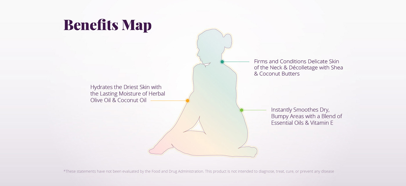
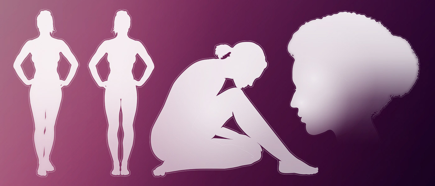
For each “ benefit map”, I created an illustration. I wanted something that was abstract and nearly a silhouette, but glowing with energy. Something that would feel at home in the future, but recall the past. Something detailed enough to feel dynamic, but abstract enough to be universal.
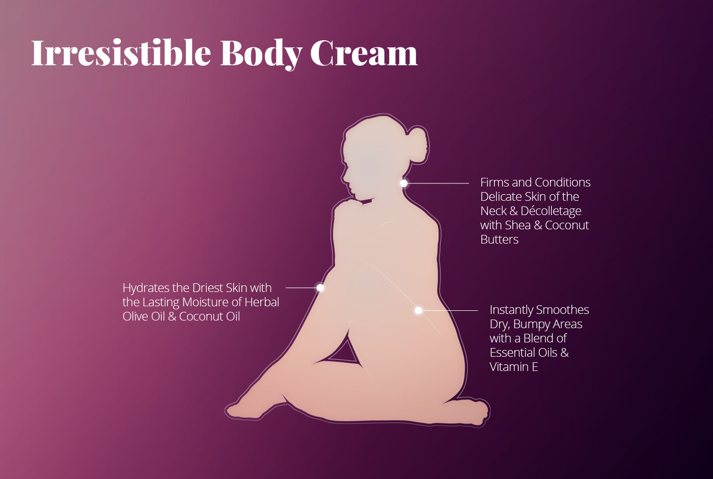
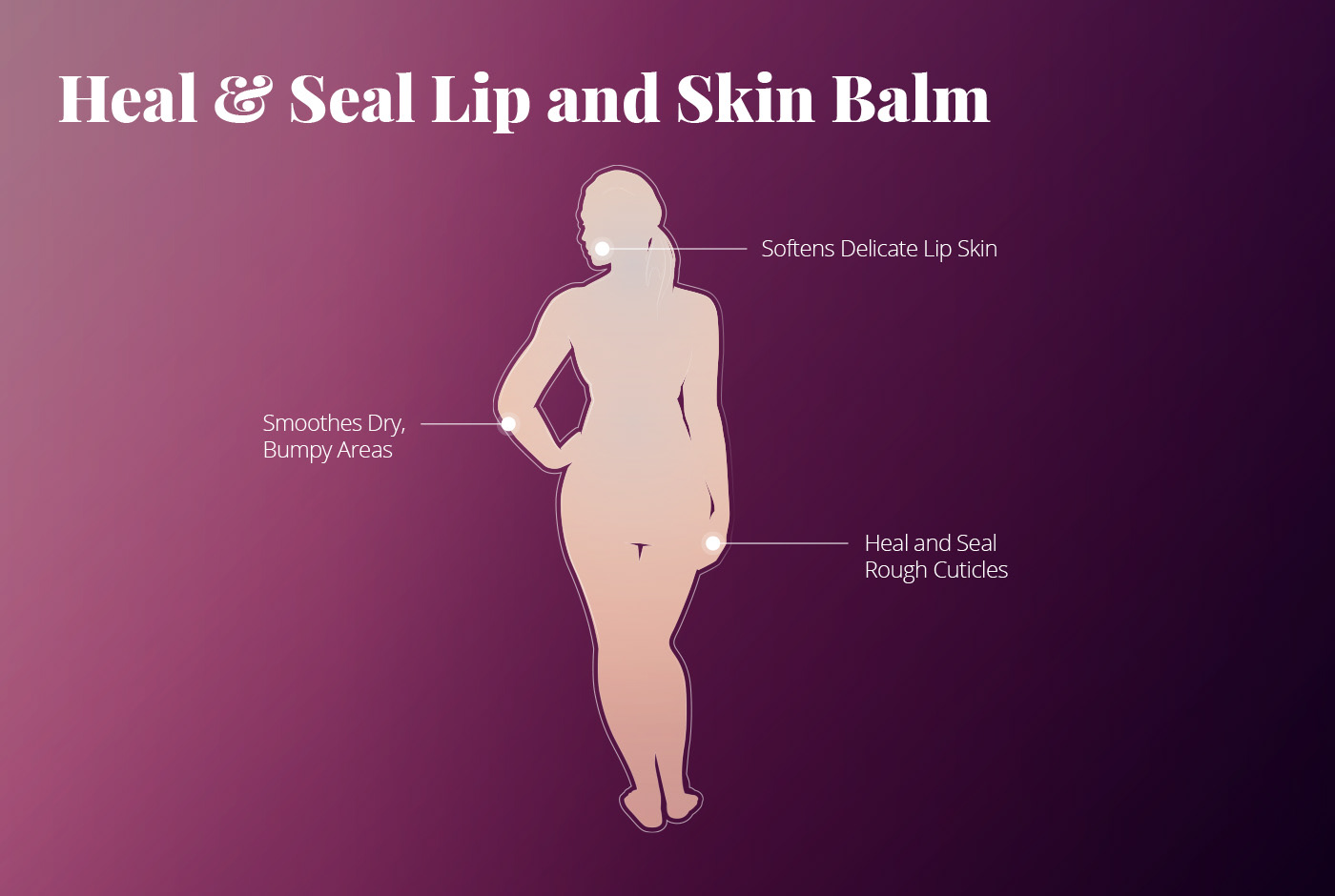
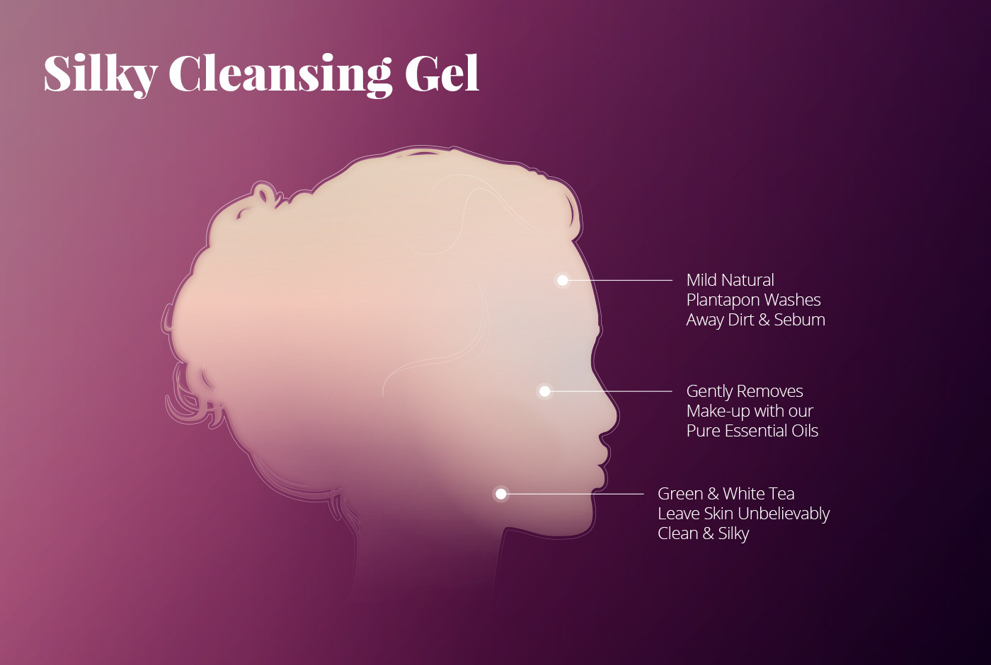
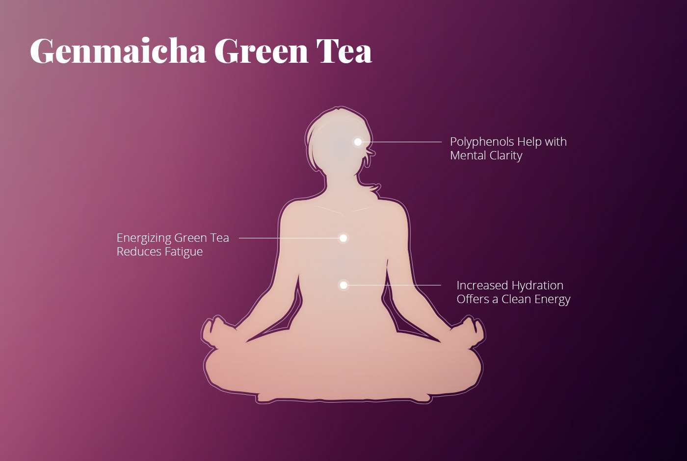
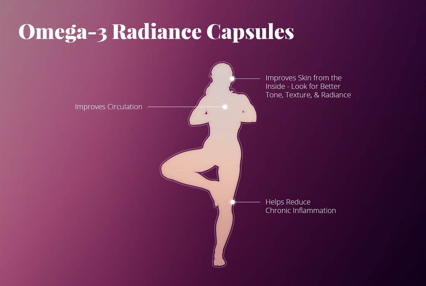
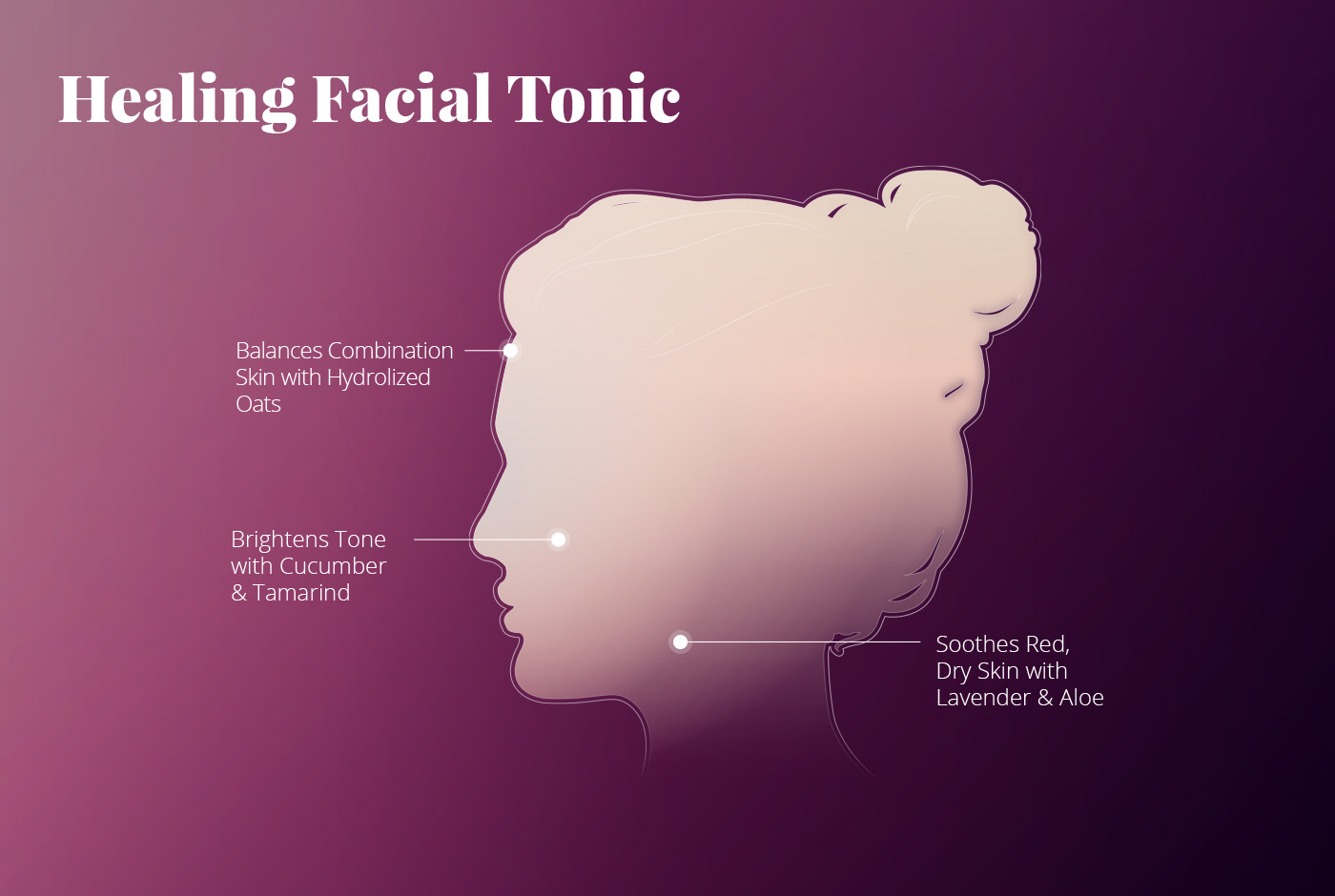

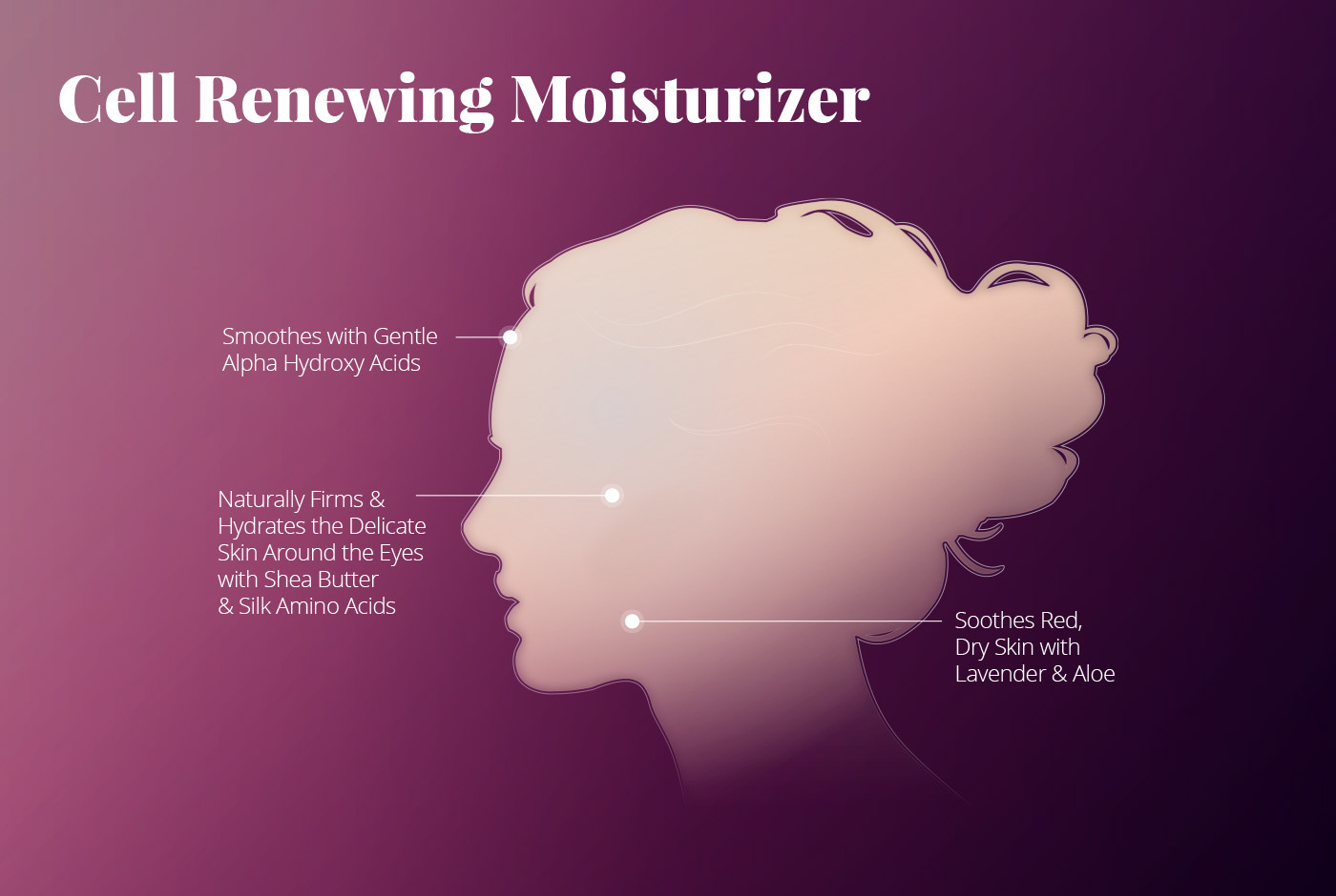
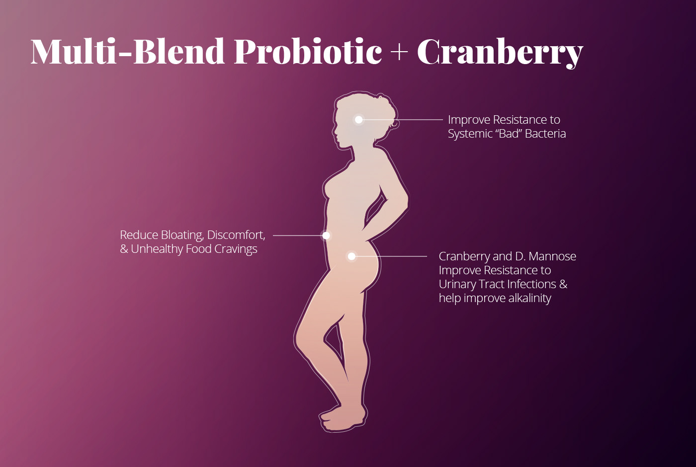
A key demographic for the brand is the wellness community, so gently reflecting this was important. It was also important to reflect the sensual, experiential component of some of the brand's 9 products.
In the end, technical limitations informed a shift to static content, although the possibility of an in-store interactive might be on the horizon some day.
In the end, technical limitations informed a shift to static content, although the possibility of an in-store interactive might be on the horizon some day.